shopify product photography
Shopify Product Photography Workflow
Master your Shopify product photography workflow. Learn image specs, sequence planning, and AI generation tips to boost conversions and reduce returns.
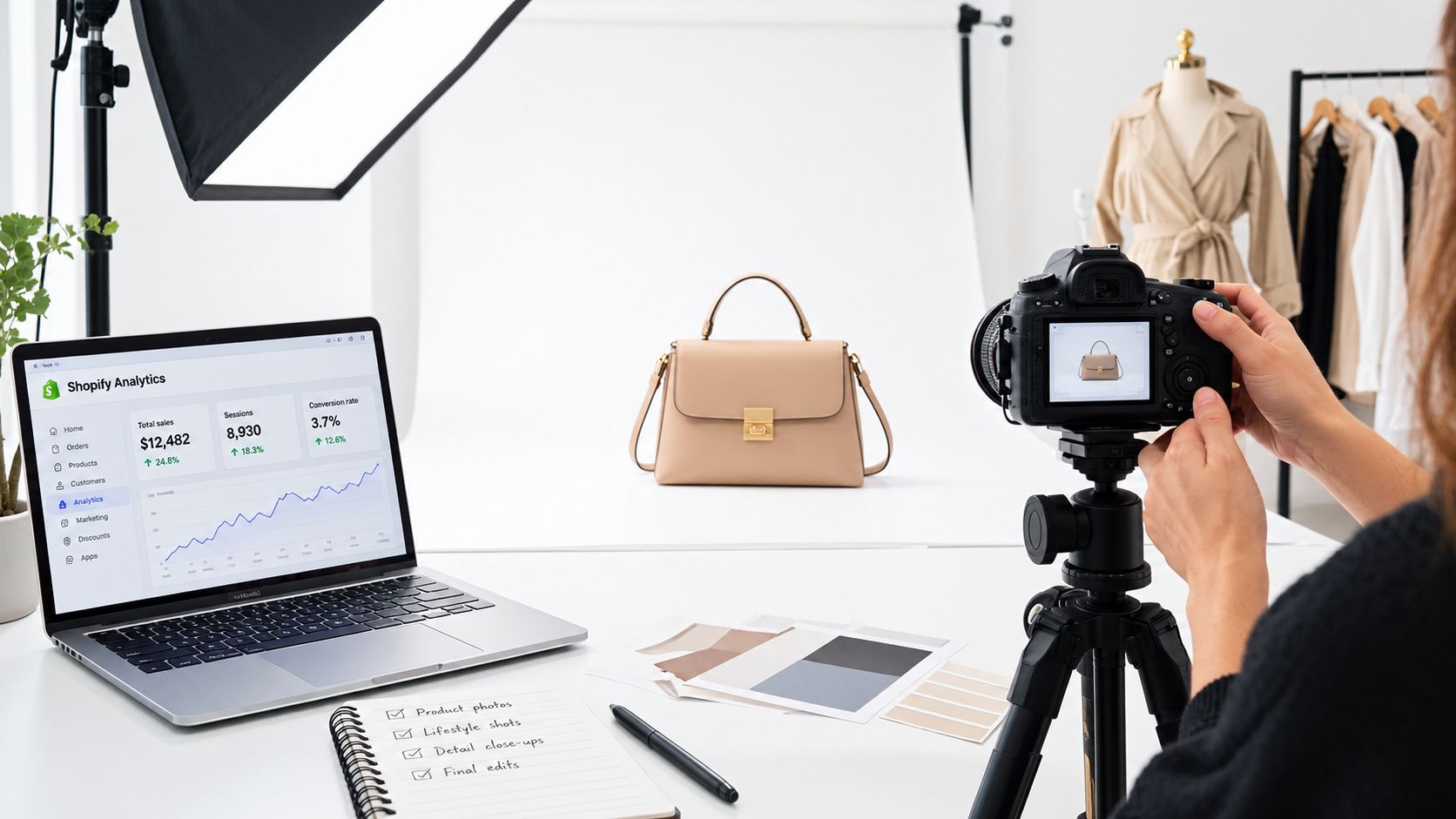
Most advice about Shopify product photography starts with the wrong problem. Merchants don't lose sales because they failed to add enough images, they lose sales because the gallery doesn't answer the buyer's objections in a clean sequence. If the first image, the next angle, and the close-up all say slightly different things, shoppers hesitate instead of moving forward.
Baymard's testing shows why the gallery matters so much. 56% of users started by exploring product images before reading anything else, and 42% tried to judge physical size from the images themselves (Baymard on image resolution and zoom, Baymard on in-scale product images). That means the gallery is not decoration. It's the main sales conversation on the page.
Table of Contents
- Designing an Evidence-Based Image Sequence
- Setting Up Shopify Image Specifications
- Capturing Essential Angles and Contextual Views
- Scaling Lifestyle Imagery with AI Virtual Try-On
- Verifying Visual Accuracy and Accessibility
- Measuring Gallery Impact on Conversions and Returns
Designing an Evidence-Based Image Sequence
A strong gallery starts with the buyer's uncertainties, and aesthetics matter after those are answered. A front-facing studio shot can establish the product, but shoppers still want to know how it looks on a body, whether the fabric has texture, and what the back shows. If the sequence leaves those questions open, buyers fill in the gaps themselves, and confidence drops.
Map each frame to a specific objection
The cleanest way to structure Shopify product photography is to give every image a job. Front view establishes identity. Back and side views resolve silhouette. A close-up answers material and construction questions. A contextual shot shows how the item behaves in real use. For apparel, that sequencing matters because shoppers cannot touch the garment, stretch the fabric, or judge drape in person.
Every slot should answer a question the previous frame left open.
Baymard identified seven broadly useful product-image types in testing, including cutouts, alternate angles, detail views, and contextual imagery (Baymard on in-scale product images). That matches what I see in catalog operations. A gallery performs better when each frame removes one layer of doubt instead of repeating the same message in a different crop.
Keep the sequence consistent across variants
Consistency matters as much as variety. If one colorway opens with a model shot, another starts with a flat lay, and a third leads with a zoomed detail, shoppers lose a clean way to compare variants. The result is decision friction.
For apparel, I usually keep the first slot simple, then move into proof. That often means hero cutout, on-body or contextual view, alternate angle, close-up, and scale reference. The order can shift by product, but the logic should stay stable. Buyers should feel that each swipe answers the next reasonable objection, not that the gallery is improvising.
Setting Up Shopify Image Specifications
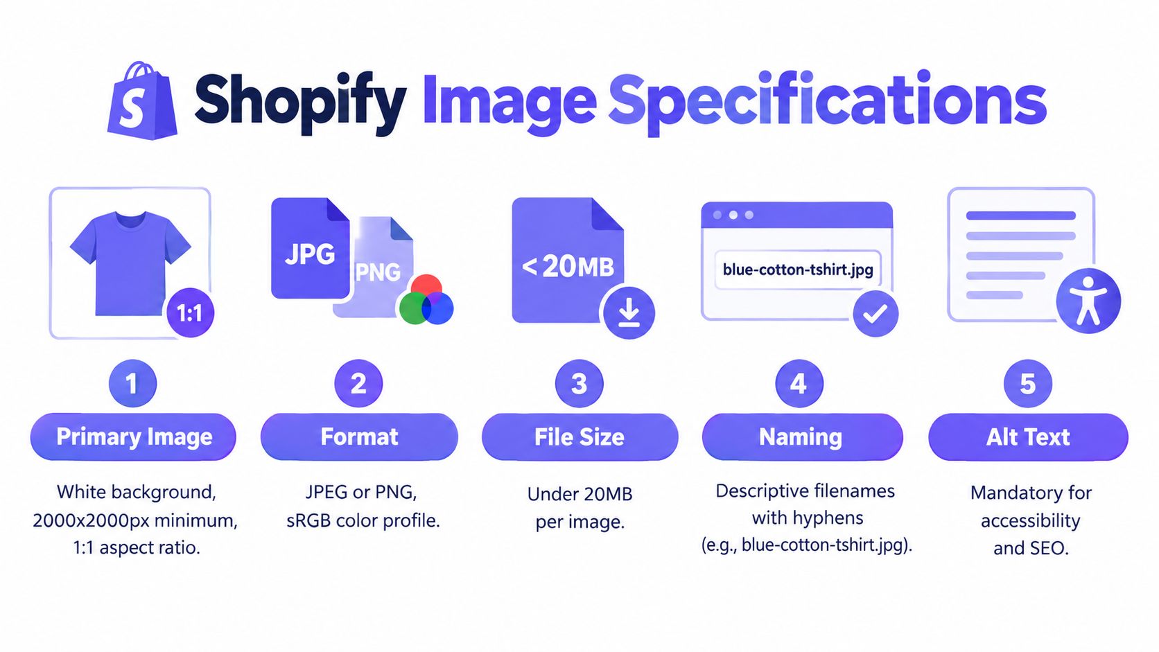
Before you shoot or generate anything, lock the technical system. Shopify's media docs specify up to 5,000 × 5,000 pixels, under 20 MB, and note that 2,048 × 2,048 pixels typically displays well for square images, with consistent aspect ratios helping layouts stay clean. That's the practical baseline for a gallery that still zooms well and doesn't collapse mobile performance.
Build one export standard and stick to it
A reliable workflow starts with a single visual system, background, crop, camera height, lighting ratio, and color target. Once that's in place, export a consistent gallery set at roughly 2048 × 2048 pixels for square products, and use a modern compressed format such as WebP where your theme supports it. Consistent dimensions stop the gallery from jumping around, which is especially noticeable on mobile.
Here's the trade-off. Aggressive compression can introduce halos, lose fabric detail, and create banding. Oversized files keep the image crisp but slow down mobile load times. The practical answer is a quality-controlled export, not a blanket compression preset.
Protect detail without bloating the file
Use a high-resolution master file and check 100% crops before publishing. Look closely at stitching, logos, hems, and edges. If those details smear at 100% zoom, the file is too heavily compressed or the source capture wasn't clean enough.
Shopify-focused guidance also points merchants toward 2048 pixels on the long edge as a useful quality threshold for zoom and retina displays, while keeping dimensions even across the gallery. For a broader platform comparison, I keep an internal reference to product image requirements for Amazon listings, since many apparel teams reuse the same asset set across channels. The goal isn't just to “have images.” It's to have images that hold up under zoom, fit the grid, and stay fast enough for real shoppers.
Capturing Essential Angles and Contextual Views
A single front image tells shoppers what the product is. It does not tell them how it fits, moves, or scales against a body. In apparel, that gap creates hesitation because the buyer is trying to judge shape from a screen without touching the fabric or trying it on.
Use angles to answer different questions
The gallery should give shoppers the cues they need to estimate size and fit, especially in apparel where proportion is hard to judge online. A back view shows construction. A side view clarifies drape and profile. A close-up answers texture and stitching. A contextual image shows how the piece reads in a real setting.
Frame every shot as visual proof. The cutout confirms the item. The next angle reduces ambiguity. The detail shot proves quality. The on-body frame shows fit language in real life. That sequence does more for conversion than stacking similar photos with small pose changes.
Give scale and use context a real slot
A model image can do work that a hanging garment cannot. It shows length, looseness, sleeve opening, and how the material sits under movement. Contextual imagery also helps when the product is part of a layered look, because the customer can see whether the item reads as structured, relaxed, or oversized.
Shoppers use images to compensate for what they can't touch, so the gallery has to do the work of a fitting room, a fabric table, and a mirror.
If you want the gallery to answer practical objections, keep the camera static and change the product or model position instead. That keeps the set easier to compare and helps each frame feel like part of one system. I also keep an internal reference to clothing product photo guidance when teams need a tighter apparel-specific shot list. The goal is simple, each angle should reduce a different doubt before the shopper leaves the product page.
Scaling Lifestyle Imagery with AI Virtual Try-On
Traditional lifestyle shoots are expensive to repeat across variants, especially when merchandising wants multiple looks, colorways, or campaign angles. That's where AI-assisted imagery becomes practical, not experimental. The value isn't novelty, it's throughput with enough fidelity to keep the product recognizable.
Use AI to test context, not to hide the product
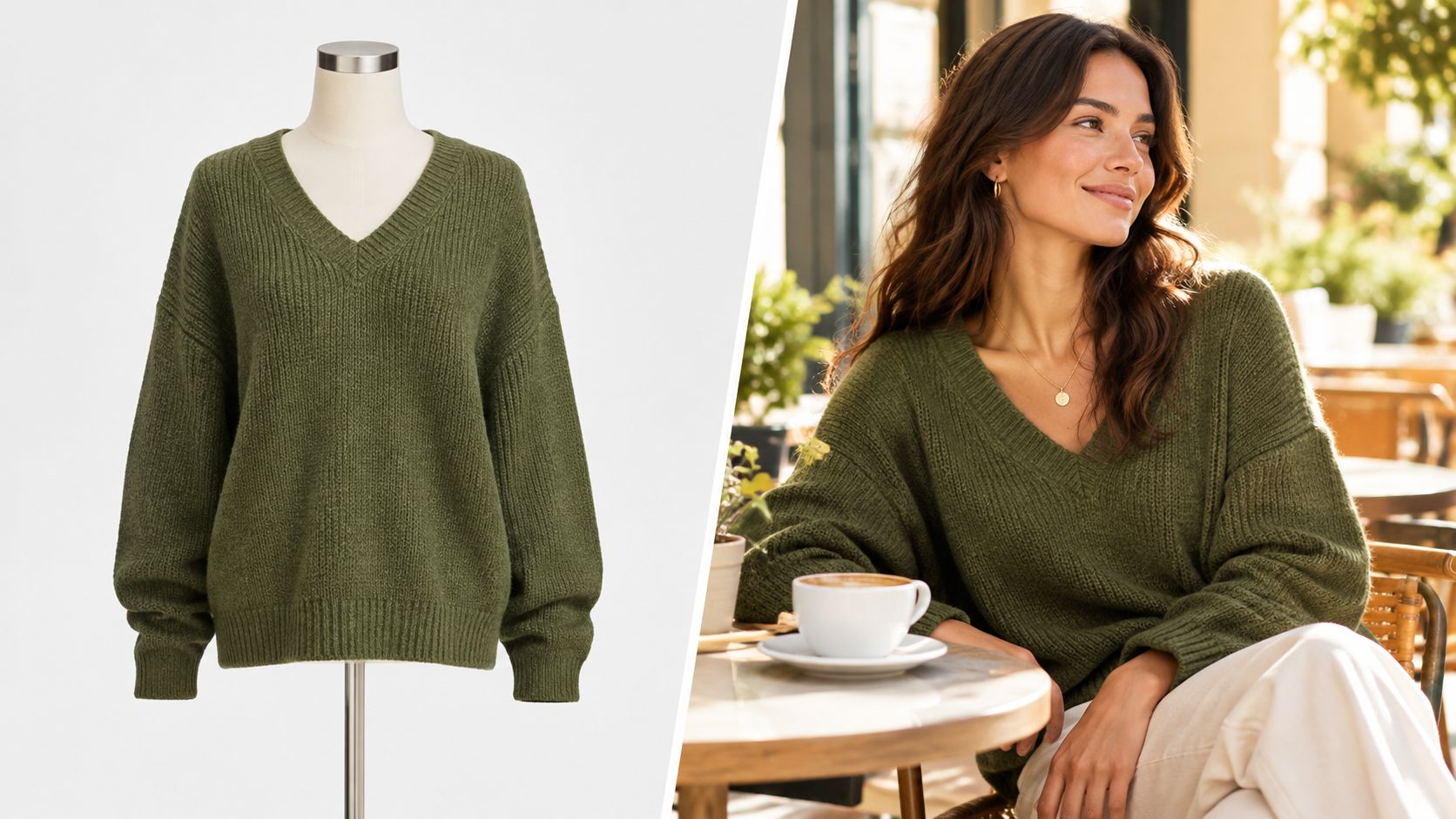
The strongest use of AI virtual try-on is controlled variation. You can test whether a complete outfit, a single-item hero, or a lifestyle setting does a better job of explaining the product. For fashion teams, that's useful because the same base garment can be rendered into multiple scenes without rebuilding the entire studio setup.
One option here is Vtry AI, which combines garment import, person onboarding, multi-garment styling, editing, and export in a shared workspace. It also supports virtual try-on with up to 7 garments in one generation, plus an interactive 3D camera for adjusting angle and perspective before rendering. Those capabilities are useful when you want to scale outfit imagery while keeping the garment library organized.
Keep fidelity controls tight
AI only helps if the product stays truthful. Preserve defining features like collar shape, sleeve length, hemline, print placement, and trim. If the output changes those details, the image is no longer serving the same job as the studio photo. That's why I treat AI lifestyle assets as complementary, not replacement, files.
After the main stills are in place, use AI to broaden the merchandising options. Generate a few contextual scenes, compare them against the plain product shot, and keep the versions that clarify the item fastest. I'd rather publish three accurate images than eight inconsistent ones.
A useful companion reference here is virtual try-on workflow guidance, especially when teams are deciding how to turn a single garment into multiple campaign-ready visuals. The workflow works best when the AI image answers a merchandising question the studio shot couldn't answer on its own.
Verifying Visual Accuracy and Accessibility
Publishing images without a quality gate is one of the fastest ways to create avoidable returns. The issue isn't just whether the photo looks polished. It's whether the image tells the truth about color, construction, and scale in a way a shopper can trust.
Check the garment against the sample
Start with the physical product. Compare the photographed or generated garment against the sample under standardized lighting, then inspect seams, edges, labels, zippers, and texture at 100% zoom. If the sample and the image disagree, fix the image or reshoot the asset. Don't assume a pleasing file is an accurate file.
Industry compilations report apparel return rates commonly around 24–30%, and other summaries attribute about 22% of returns to products appearing different from their online images (Vovv AI product photography statistics). Those figures aren't Shopify-specific causal proof, but they do point to the same operational risk. Visual mismatch is expensive, and it's often preventable.
Treat alt text as a truth layer
Shopify's product-media documentation stresses technical limits, consistent aspect ratios, and descriptive alt text, while also noting the need for accessible product media (Shopify product media documentation). In practice, alt text should describe what the image confirms, not what the seller hopes the buyer infers. Say “blue cotton T-shirt with ribbed crew neck and short sleeves,” not “perfect fit” or “premium feel.”
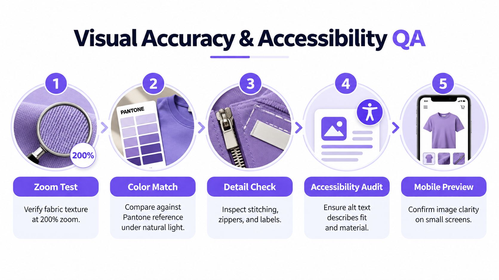
Practical rule: if a detail can't be confirmed from the image or product data, don't put it in alt text.
For AI-generated assets, add one more pass. Check for warped logos, broken fingers, odd sleeve joins, face contamination, or mismatched garment edges. Then validate on mobile, where small defects become easier to miss during upload and easier to notice after launch. Accessibility and visual accuracy need the same discipline, because they both depend on honest product representation.
Measuring Gallery Impact on Conversions and Returns
The gallery only matters if it changes behavior. That means testing the new sequence against the old one with the rest of the page held steady, then reading the result through both purchase and post-purchase metrics. If price changes, traffic sources change, or copy changes at the same time, the image test is contaminated.
Compare one gallery against another
Run a controlled test where the original gallery and the revised gallery are compared while price, traffic source, merchandising position, and copy remain unchanged. Then measure add-to-cart rate, conversion rate, image-gallery interaction, returns attributed to mismatch, and page-speed metrics. Conversion alone is too narrow, because a gallery can lift orders while also increasing avoidable returns if the images overpromise.
The point of the test is to learn which visual proof reduces uncertainty fastest. In many apparel catalogs, the winning gallery is not the prettiest one. It's the one that answers size, fit, and material questions with the fewest swipes and the least ambiguity.
Read the result in operational terms
If image interaction goes up but add-to-cart doesn't move, the gallery may be attracting attention without resolving hesitation. If add-to-cart improves but returns rise, the visual sequence may be persuasive but misleading. Both outcomes are useful, because they tell you whether the issue is presentation or expectation-setting.
I'd also keep an eye on page speed after every image change. Oversized assets can hurt mobile performance, and a slower page makes the whole gallery harder to evaluate. That's why the export discipline in the earlier section matters, not just the visual style.
For teams managing a large catalog, the key win is repeatability. Once one sequence proves it can reduce mismatch, you can apply the same structure to other products without rebuilding the logic every time. That's how Shopify product photography becomes an operating system instead of a creative gamble.
If you want a repeatable way to produce outfit visuals, contextual scenes, and try-on assets without rebuilding every shoot from scratch, explore Vtry AI. It helps teams import garments, generate on-model and outfit images, and keep visual assets organized for Shopify workflows. Use it to test clearer galleries, tighten product truth, and move faster from concept to publish.